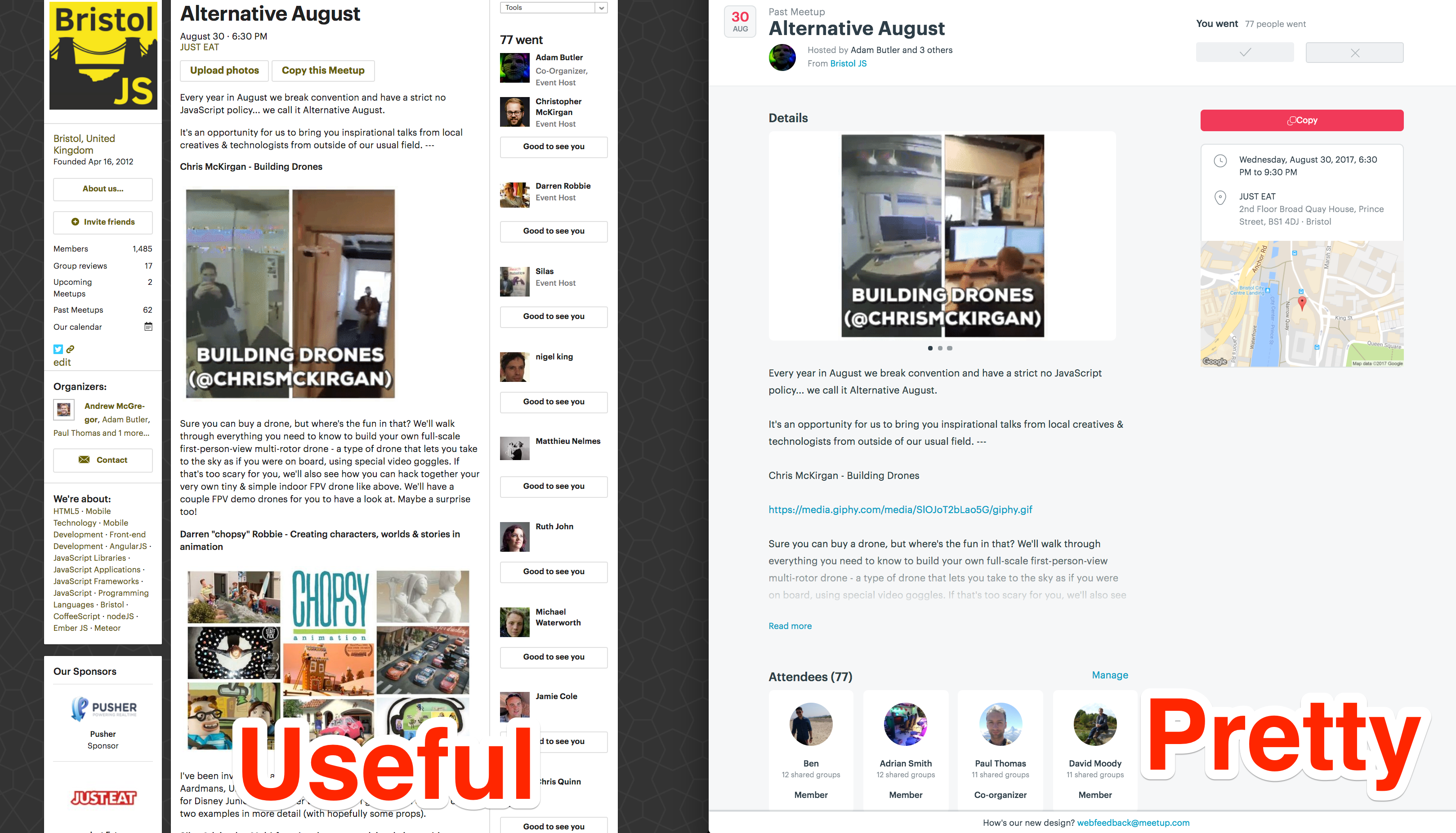
Many of us, myself included, have spent years building communities on your platform. While not without rough edges, Meetup provides a suite of tools that have been an integral part of how we communicate with our members. We have been hugely encouraged by all the recent hard work that has been put in to improving the look and feel of Meetup after a long period of stagnation, but we feel that several of the changes will have a negative effect on our communities. In a few days you will force changes that impact how we communicate with our members and provide no ability to opt-out, removing important features and changing others in ways that will be detrimental to how we clearly communicate with our members. Individually, many are quite small, but the cumulative effect is significant.
Here are some of our concerns with the new version, which we hope you’ll take as constructive feedback from long-time users of your platform.

Community page
- Only one organiser is listed by name, this introduces inequality for the many groups are equally run by several members.
Details
- The copy is now cut-off meaning that the name, title and details of our second, third etc speakers are no longer shown by default.
- Text formatting has been removed, meaning that we can’t implement headings for our speakers.
- Photos in the description are now loaded into a carousel and lose the context in which they were placed.
Organisers / Hosts / Attendees
- It’s always useful to see who of your friends in the community are coming as well as the ones who are not, these are no longer exposed instead just opting for a select few.
- Organisers are no longer listed together at the top of the list.
Comments
- Threading is completely broken, this has a negative effect for retrospective events.
Sponsors
- Many communities rely on sponsorship, these changes drastically de-emphasise their presence.
Diversity
The diversity of our attendees is something many of us work hard to address, especially for tech meetups where there is a preconception about what they will be like. a number of the changes will make that harder to address. Our Meetup event page is the shop window to our group. By hiding most of the attendees, and removing our ability to emphasise aspects of the group or event through simple formatting tools, it becomes much harder to encourage those who might have second thoughts by emphasising the positive steps we take.
Wrap up
Much of the new interface is a definite improvement over the old version. The community page especially looks refreshed, in general, but we think your team need to spend a bit more time looking at how event hosts actually use the platform and build something that is compatible and empowers us to build strong communities with great planning and communication tooling.
❤️
Roger Shepherd / Bristol and Bath Internet of Things Meetup
Simon Starr / Bath Ruby User Group
Nic Alpi / Design / Build / Market
Are you a Meetup organiser and would like to sign this open letter? Add your details here. These people have:
Karl Tynan & Lee Kelleher / umBristol
Joseph Woodward / .NET South West
Calum Ryan / Tonbridge Digital
Piers Storey / Oxford Python
Update 10th November 2017 08:15:
😄 I’d like to thank Meetup CEO Scott Heiferman & VP of Product Fiona Spruill who have responded to this letter. Their responses acknowledge our concerns, and state that they take them seriously. Now we can only hope this translates into reality and changes are implemented to have a positive impact on our communities. See the responses below:
We hear you, thx for caring so much! We’re setting up to make meetup MUCH better in 18. Will consider tweaks -don’t want to cause u trouble- but focused on bigsteps to help u make members happier,sponsors,diversity,etc. Thx for patience &thoughful letter @fionaspruill @farahassir
— Scott Heiferman (@heif) November 10, 2017
Thanks for your thoughtful letter and for caring so much about @Meetup. We are listening and take your concerns seriously!
— Fiona Spruill (@fionaspruill) November 10, 2017